Table of contents
- What we scored these 12 sites on, and why "looks great" doesn't pay rent
- The conversion scorecard: 5 criteria every restaurant site should pass
- Sites #1 to #3: order path done right, from first tap to checkout
- Sites #4 to #6: great menus, buried CTAs, and what it's costing you
- Sites #7 to #9: beautiful on desktop, painful on a phone
- Sites #10 to #12: that "Order Now" button routes to a marketplace
- The 5 elements your restaurant website needs to convert, not just impress
- Audit your own site in 10 minutes, because most sites fail at least 3 of these 5 checks
- Your website is either closing orders or sending them somewhere else
- Frequently Asked Questions about Restaurant Websites
Google found that 53% of mobile visits are abandoned when a page takes longer than three seconds to load, so plenty of sites lose the order before the menu even appears. Having a site and having a site that converts are two different things. Ranking restaurant websites on food photography, color palette, and brand vibe misses the thing that pays rent: whether the site turns a visitor into an order.
Below are 12 real restaurant websites ranked on the five signals that actually drive orders, not aesthetics. You will also get a reusable scorecard you can run on your own site in 10 minutes, plus a clear picture of what the best and worst restaurant website design examples do differently.
Key Insights
- Routing your website's "Order Now" button to a marketplace like DoorDash or Grubhub costs you 15% to 30% commission on every order your own marketing earned. Fixing that single button is the highest-ROI change on most independent restaurant websites
- A PDF menu versus a live menu is not a minor formatting choice. A PDF can't be indexed by Google, can't be read comfortably on a phone, and can't be updated without uploading a new file. It is the single most common conversion killer on independent and fast-casual restaurant sites
- Most of your customers are searching on a phone. If your "Order Now" CTA is below the fold on a 375px screen, most visitors who land on your homepage never see it
- The best-converting restaurant websites share one trait: the path from homepage to order confirmation takes three taps or fewer on mobile. Not a redesign budget. Not a professional photographer
What we scored these 12 sites on, and why "looks great" doesn't pay rent
Diners increasingly check a restaurant's website before visiting or ordering, which means your website is almost certainly the first real interaction a potential customer has with your restaurant. If it fails them in the first 10 seconds, they close the tab and order somewhere else.
Most "best restaurant website" roundups critique design. They praise a moody hero image, generous whitespace, tasteful animations, warm ambiance, and a cohesive brand identity. Diners notice those things, but they are not what converts a visitor into a paying customer.
The five criteria used to score every site in this list:
- CTA placement: is "Order Now" visible on mobile without scrolling?
- Menu format: is it a live, indexed web page or a PDF?
- Order friction: how many taps from homepage to checkout?
- Mobile load: does the site load and function on a cellular connection?
- Trust signals: are operating hours, a click-to-call number, and reviews or press badges visible?
Each of the 12 examples below gets a Pass, Partial, or Fail on all five criteria. No design critique. Just the signals that determine whether a visitor orders from you or from your competitor.
The conversion scorecard: 5 criteria every restaurant site should pass
Before the examples, apply this framework to your own site right now.
Criterion 1: Above-the-fold CTA on mobile
The "Order Now" button must be visible on a 375px-wide screen without scrolling. Full-screen hero images and auto-playing video are the two most common culprits that push it below the fold. If a customer has to scroll to find the button, you’ve probably lost them. The strongest calls to action sit where the thumb already rests.
Criterion 2: Live menu page, not a PDF
A PDF menu fails on three levels. Google can't crawl it, so your menu items don't surface in local search. It can't be read comfortably on a phone without zooming. And you can't update a price or 86 an item without uploading a new file. A live HTML menu page solves all three. The PDF menu versus live menu decision costs you real orders every day.
Criterion 3: Click-to-call phone number
A tap on your phone number should open the dialer immediately. A number displayed as plain, unlinked text is a dead end for every mobile visitor trying to call in an order or ask about your operating hours.
Criterion 4: Direct ordering vs. third-party redirect
Does your "Order Online" button route to a branded checkout you control, or to a marketplace that charges 15% to 30% commission on every order? This is the question no other ranking article asks, and it carries the biggest dollar impact.
Criterion 5: Accurate hours and address
Hours and address are the most-searched items on any restaurant site. Outdated operating hours send customers to a locked door, then to a competitor. Keep both on the homepage, not buried behind a contact form.
Scoring: Pass means the site fully meets the criterion. Partial means it meets it on desktop but not mobile, or meets it inconsistently. Fail means it does not.
Sites #1 to #3: order path done right, from first tap to checkout
Site #1: Shake Shack (fast-casual burger)
Scorecard: CTA above fold: Pass | Live menu: Pass | 3 taps or fewer: Pass | Mobile load: Pass | Trust signals: Pass
Shake Shack's mobile site puts "Order" as the first interactive element in the header, visible before any scrolling, in a high-contrast color that stands out from the navigation bar. The menu is a live scrollable page with item photos, prices, and modifier options built directly into the page. Checkout does not require account creation for a first-time guest order.
The detail that's easy to miss: their phone number and location hours are reachable from every page through a persistent location selector, not buried in a contact page three clicks deep.
Your takeaway: move your "Order Now" button into the header, not the hero section. The header travels with the visitor on every scroll.
Site #2: Blaze Pizza (fast-casual pizza)
Scorecard: CTA above fold: Pass | Live menu: Pass | 3 taps or fewer: Pass | Mobile load: Pass | Trust signals: Pass
Blaze Pizza's homepage on mobile opens with a single dominant CTA above the fold. Their menu is a live web page with clear category navigation: no PDF, no external link, no download prompt. A first-time visitor can tap "Order," select a pizza, and reach payment confirmation in three taps.
The detail that's easy to miss: their homepage includes a visible loyalty sign-up on the same screen as the CTA, a trust signal that reduces hesitation for first-time visitors without adding friction to the order path.
Your takeaway: pair your CTA with one trust signal (a review snippet, a press badge, or an order count) on the same above-the-fold screen. It reduces hesitation without adding a tap.
Site #3: Sweetgreen (fast-casual bowl concept)
Scorecard: CTA above fold: Pass | Live menu: Pass | 3 taps or fewer: Pass | Mobile load: Pass | Trust signals: Pass
Sweetgreen's mobile site leads with location detection and an immediate "Order" prompt. Their menu is a live, scrollable, image-rich page with prices and dietary filters built in. The order path is clean: tap Order, build your bowl, pay. Three steps, no account wall.
The detail that's easy to miss: navigation on mobile is minimal. Fewer navigation options means fewer distractions between the visitor and checkout, a small but real user experience win.
Your takeaway: audit your navigation bar on mobile. If it has more than four items, you are giving visitors too many reasons to wander away from "Order Now."
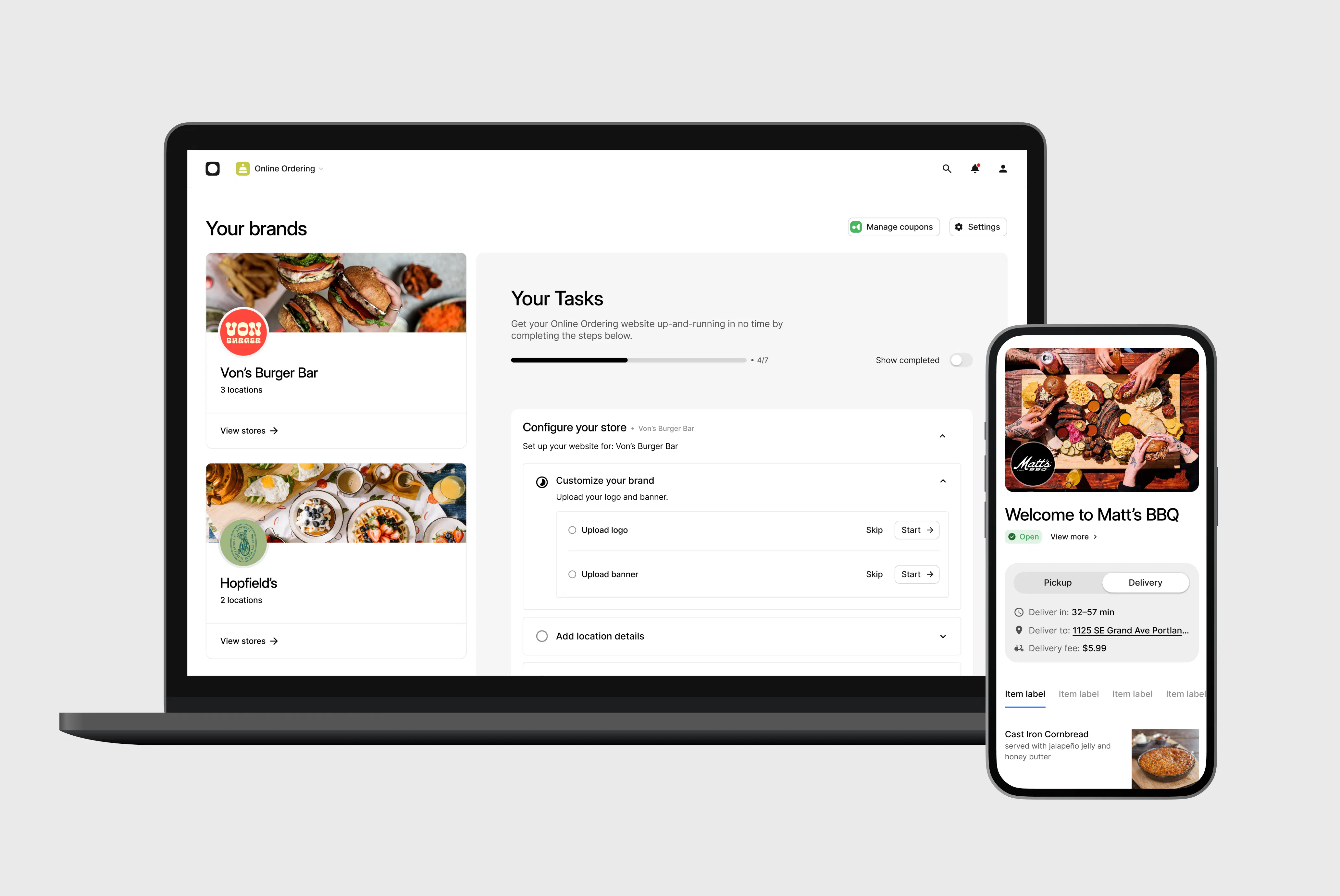
You can hit all five of these marks without a dev team or a custom build, even as an independent operator. Otter's Online Ordering gives your customers a branded checkout they reach straight from your own site, with zero marketplace commission, so the traffic your marketing earns turns into direct orders instead of commissions.
Sites #7 to #9: beautiful on desktop, painful on a phone
Google found that 53% of mobile site visits are abandoned when a page takes longer than three seconds to load. Your customers decide within that timeframe whether to order. A site that looks stunning on a laptop but fails on a phone loses the majority of its visitors.
Site #7: An independent burger spot (single location)
Scorecard: CTA above fold: Partial | Live menu: Fail | 3 taps or fewer: Fail | Mobile load: Fail | Trust signals: Partial
On desktop, this site is sharp. Open it on a phone with WiFi off and the experience collapses. The menu is a PDF. On a 6-inch screen, reading a price takes three pinch-zooms. The hero image takes 8 seconds to load on a 4G connection. The phone number is displayed as plain, unlinked text, so tapping it does nothing.
The test that counts: open your site on a phone, turn off WiFi, and try to place an order. That is the test your customers run every day.
Site #8: A ghost kitchen (virtual brand, delivery-only)
Scorecard: CTA above fold: Partial | Live menu: Partial | 3 taps or fewer: Fail | Mobile load: Fail | Trust signals: Fail
A ghost kitchen depends entirely on its online presence. There is no walk-in traffic to make up for a bad website. This site has a live menu, but it is formatted for desktop, with a three-column layout that becomes unreadable on mobile without horizontal scrolling. Operating hours are visible only in a 10px footer font.
Your takeaway: for a ghost kitchen or virtual brand, your website is your storefront. Mobile-first is not optional. It is the entire business model.
Site #9: A regional QSR chain
Scorecard: CTA above fold: Pass | Live menu: Pass | 3 taps or fewer: Partial | Mobile load: Fail | Trust signals: Pass
Strong on most criteria, but a large auto-playing video in the hero stalls on cellular connections and delays page load by 6 to 10 seconds. On a 4G connection with WiFi off, the page is still loading when most visitors have already bounced. Mobile-friendly means a customer on a phone, with one thumb, on the move, can place an order in under three taps.
Your takeaway: a hero video is the most common thing standing between a fast site and a slow one. If yours auto-plays, replace it with a static hero image so the CTA loads first and the order starts sooner.

The 5 elements your restaurant website needs to convert, not just impress
This checklist is built for every kind of restaurant, whether you run a neighborhood bistro, a fast-casual concept, a QSR, a ghost kitchen, or a multi-location independent.
It doesn't matter whether you built your site on Wix, WordPress, Squarespace, BentoBox, a general CMS, or a purpose-built restaurant website builder like Otter’s. The same five elements decide whether it converts.
- Above-the-fold CTA on mobile: high-contrast color, readable at arm's length, living in the header so it appears on every page.
- Live menu page, not a PDF: searchable by Google, readable on any screen without zooming, editable in seconds without file uploads. Keeping it in sync with your kitchen is easiest when your menu lives in your POS, like Otter POS, and pushes updates to the site automatically.
- Click-to-call phone number: in the header, linked on every page; tap it and the dialer opens.
- Direct ordering link: routes to your branded checkout, not a marketplace; you keep the revenue and the customer data.
- Accurate operating hours and address on the homepage: formatted so Google can read and surface them in local search, not hidden on a contact page.
- Trust signal above the fold (bonus): a review snippet, a press mention, or a visible order count. You can also surface options to reserve a table or buy gift cards here if they fit your concept.
A site missing even one of these is actively routing orders elsewhere. Not because of bad food photography or the wrong color scheme. Because of friction.
Audit your own site in 10 minutes, because most sites fail at least 3 of these 5 checks
You don't need a web designer or a Lighthouse score to run this audit. You need your phone.
- Open your site on your phone with WiFi off. This replicates how most of your customers find you: on a cellular connection, in the middle of doing something else.
Tip: If the page is still loading after three seconds, that alone is costing you visitors before they read a word.
- Count how many scrolls it takes before you see your "Order Now" button. If the answer is more than zero, it is below the fold for most mobile visitors.
Tip: Move the button into the header so it travels with every scroll instead of living in the hero.
- Tap your phone number. If the dialer doesn't open immediately, it is not click-to-call and you are losing call-in orders right now.
Tip: Link the number on every page, not just the contact page, so a caller never has to hunt for it.
- Open your menu. If it opens as a PDF, count how many pinch-zooms it takes to read a price. That friction costs you orders from customers who won't fight with a file.
Tip: Swap the PDF for a live HTML menu page so Google can index each item and diners can read prices without zooming.
- Tap "Order Online" and watch the URL that loads. If it contains a marketplace domain, your own website is generating marketplace commissions instead of direct revenue.
Tip: Point the button at a branded checkout you control so the orders your marketing earns remain commission-free.
Fix all five and you will see a measurable lift in direct order volume with no redesign, no photoshoot, and no developer. The best-converting restaurant websites aren't the most beautiful ones. They are the ones that get out of the way between a hungry customer and a completed order.
If your audit turned up even one of these issues, you know exactly where your orders are going. Otter's Online Ordering gives you a menu you can update in minutes and a checkout that keeps your revenue on your side of the table.
Your website is either closing orders or sending them somewhere else
There is no middle ground. Every element on your site either shortens the path to checkout or lengthens it. A buried CTA, a PDF menu, an unlinked phone number, a marketplace redirect: each one is a door you leave open for a competitor to walk through.
The sites that convert the most don't have the best food photography or the biggest redesign budget. They just removed the friction. Run the five-step audit on your phone right now and you'll know exactly which door to close first.
Frequently Asked Questions about Restaurant Websites
What makes a restaurant website convert well instead of just look good?
Conversion comes from removing friction between a visitor and a completed order. That means a CTA above the fold on mobile, a live menu page instead of a PDF, a click-to-call phone number, a direct checkout that doesn't route through a marketplace, and accurate hours on the homepage. A visually impressive site with a buried CTA or a PDF menu will consistently lose orders that a plainer, frictionless site would close.
Should I use a PDF menu or a live web menu on my restaurant website?
A live web menu page wins on every practical measure. It loads fast on mobile data, customers read prices without zooming, Google can index individual items so they surface in local search, and you can update a price or remove an 86'd item in seconds without uploading a new file. The PDF menu versus live menu decision is one of the most impactful changes you can make today.
What is the difference between direct online ordering and routing to a third-party marketplace?
Direct ordering means customers place and pay on your branded site. You collect the full order value and own the customer data. Routing to a marketplace from your own website means you generate orders for a platform that charges 15% to 30% commission, even though the customer found you on your own site rather than through the marketplace app.
How many taps should it take to place an order from a restaurant homepage on mobile?
Three taps or fewer is the benchmark for high-converting restaurant sites: tap "Order Now" on the homepage, select items from the live menu, confirm payment. Every additional step, like account creation, ZIP-code verification, or an upsell interstitial, increases abandonment, especially on mobile.
What is the most important element to have above the fold on a restaurant website?
Your primary CTA, whether it reads "Order Now," "Order Online," or "Start Your Order," must be visible without scrolling on a mobile screen. Full-screen hero images and auto-playing video are the two most common reasons independent restaurant sites push this button below the fold on phones. Check your own site by opening it on a phone with WiFi off.
How do I know if my restaurant website is truly mobile-friendly?
Open it on your phone with WiFi off and try three things: see the "Order Now" button without scrolling, tap your phone number and have the dialer open immediately, and read a menu price without pinching and zooming. Failing any one of these is a real mobile problem, regardless of what a "mobile responsive" label promises about the template.
How do I get my restaurant website to show up on Google?
Make sure your Google Business Profile matches your website exactly on name, address, phone, and hours, put your city and neighborhood in plain text on your homepage, and use a live HTML menu so Google can index your items. A fast-loading, mobile-first site with structured data does most of the rest. Otter's guide on restaurant SEO keywords walks through the terms worth targeting.
Can I build a good restaurant website without hiring a developer?
Yes. A purpose-built restaurant website builder lets you publish a site with your menu, hours, contact information, and a direct online ordering link without writing any code. The key is choosing a platform that keeps your menu and pricing in sync automatically, otherwise you are back to the original problem of an outdated site.
How often should I update my restaurant website?
Every time your menu, hours, prices, or contact information changes. Outdated information is a leading reason restaurant websites lose customers to a competitor. If your current site takes more than five minutes to update or requires contacting a developer, that is a platform problem, not a time-management problem.

Build your restaurant website with Otter